LE Designs Blog Monthly Events

LE Designs Blog Monthly Events
1st Thursday of the month - A review of a craft product
2nd Thursday of the month - Craft room inspiration
3rd Thursday of the month - Stamp set/die cutter review
4th Thursday of the month - A craft room storage idea
Any 5th Thursday in a month - *GIVEAWAY*

Tuesday, 15 April 2014

STILL Busy busy…….

Evening all,

Despite having a great week with both my husband and the kids off on holiday, there just doesn't seem to be very much crafting time available…It's trips to the park, museum, cinema etc instead.

I did manage to escape at the weekend for a few hours though and went to my very first Ross Papercraft show. It was not really what I was expecting, although I'm not sure what I was actually expecting to be honest…for a start, my friend and I were the youngest there by far and there were many an old lady turning up with a shopping trolley!! I found that although there were lots of exhibitors there, they almost had too much stock - and each exhibitor had much about the same. The one exhibitor I was so excited to see was Stampin' up - but they weren't there!!!! There was a company selling Visible Image stamps who do one of my favourite stamps - the butterfly you see me using in lots of my cards and so I thought I would buy the dragonfly too - but they had no stock of this!!! Typical!!

I was also hoping to see stencils & embossing paste which is a big thing just now, but there was none. The one thing I found was a big trend with all exhibitors was building flakes. I was SO tempted to buy this - but I would need the flakes, the glue, the sponge……too much just now.

I did however pick up some bits and pieces. I got lots of interesting cards - glitter, pearlised, Kraft etc. I bought Glossy accents which I am so excited by and have used on the one card I will share with you for the Clearly Besotted Challenge.

Today after being at the park, my husband had to nip to his work to do a quick 5 minute task and since it is quite near to Hobbycraft, I got to get a quick 20 minutes in there too. I have bought some liquid pearls, perfect pearls and a red embossing powder. I was looking also for a charcoal coloured ink, but sadly, they didn't have any. Can't wait to have a shot of these new products, but unlikely to get to until the end of the week.

I have also now agreed to begin a 'couch' to 5k challenge with two friends so quite when I will actually have time for crafting - who knows!!! I'm sure I will squeeze it in though!!

This afternoon I managed to get out and take proper photos of the Easter cards I have made this year as the ones I took the other night were pretty poor!! Apologies for boring you with the same pictures again!!

Oh, and for those have been following my big boy bed progress….I am now down to only returning my little one to bed 10 times!!!!!!! Huge progress from the 90 times the first night!!!!!!! :-) In my next post I will share the card I have made for the 'Spring' theme at Clearly Besotted.

Laura xxx


Saturday, 12 April 2014

Busy busy……Easter cards to share

Hello all,

Sorry for the lack of posts over the past week or so. I have been mega busy with my two boys due to it being the Easter holidays but I've also had a family bereavement to contend with, which required the production of 50 orders of service. I have also been busy working on Wedding Invitations for my best friend's wedding……all this has left very little 'me' crafting time!!!! I have however been bust creating Easter cards for all our family which I am here to share with you now. These are all made using Uniko Studio or Clearly Besotted Stamps. They have been photographed very quickly tonight and so the lighting is not the best. I have reserved one card that I will photograph and share properly tomorrow, as I am going to enter it in to the latest Clearly Besotted competition. For now though, here are the others.

Any comments as always are very much appreciated - I would love to hear which is your favourite!!

Laura xxx

1. 

2. 

3. 

4. 

5. 

6. 

7. 

8. 

9. 

Saturday, 5 April 2014

Thinking of you Card - Less is More

My second post tonight - but a really quick one this time. I had some sad news about a friend having some health issues and so I decided to make her a very quick, but special thinking of you card.

As you will read from my previous post, I am not the proud owner of watercolour paper and paints and my favourite layout just now is two tags (although I don't have tag dies - YET).

I decided to watercolour one tag and emboss in sea foam white with my favourite Uniko Studio stamp from the Pure Florals Chrysanthemum set. I created a second tag in vellum and embossed it too using the same stamp then added a 'thinking of you' sentiment, again from Uniko Studio from the Flower Power 1 set.

I assembled this on a white card base, added a button, twine and some sequins & Pearls then took a really quick photo before sending it away to my friend. (Photo quality not as good as normal)

Since this card has a 'hint' of turquoise, I am going to enter it in to the latest Less is More challenge.

Really need to go for now, so will add my actual resources used tomorrow.

Laura xxx


Art Deco Butterfly for Seize the Sketch 17 and The Card Concept 7

Good evening all,

I am feeling very proud of myself as I blog tonight after defeating my toddler in the 'big boy bed' battle. We decided to change from a cot to a bed last weekend and it did not go well!! He was able to get into his wardrobe and pull everything out, he could switch the light on and off and he repeatedly came out of his bedroom…..we eventually cracked at 9.30pm and turned his bed around so he was wedged against the wall and could not get out…..tonight though, we decided to go for it properly. He was returned to his room at least 60 times over an hour and a half period, but he then said 'night night Mummy' and fell asleep…..phew!! They do say it gets easier from now on!!!!! Here is hoping.

While my husband puts child number 2 to bed (who has had to have a late night in order to give peace and quiet for the extended toddler bed time), I have the chance for some quick blogging to share a card I made earlier…..

My lovely husband came home with a wee impromptu gift the other night - some gorgeous designer paper and some lovely buttons!! So much better than a bunch of flowers (although they might be nice too!!!). One of the designer papers was an Art Deco pack by Docrafts - Roaring Twenties it is called. I have been desperate to use it ever since.

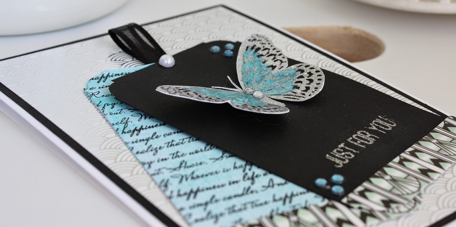
I began looking at how maybe a couple of the papers would work together, but it was actually really tricky as each of the patterns are quite bold in themselves and don't actually work that well together. I knew the fore, that they would have to just be accents as apposed to centre pieces on a card. Much of the papers work around a black, silver and turquoise colour scheme and I knew that I just had to match them with a butterfly in the same colours. I absolutely adore Visible Image's butterfly stamp and it works so well in lots of different colour schemes. I decided to emboss it in silver EP and colour the butterfly black and turquoise. I used a black felt pen and then a turquoise watercolour paint (my new favourite medium) which worked fantastically.

I decided to use my favourite layout just now which is two tags….I decided to have one in black to create quite a bold statement and then I watercoloured another tag in the same turquoise as I had used for the butterfly.  I then stamped a script image by Waltzing Mouse in black over the water coloured tag. Now, I don't actually have any tag dies yet (shocking I know!!!) so I used my WRMK art deco corner chomper instead.

I added a strip of art deco DP to each tag and then assembled the card using a white base, a black layer and then a layer of a white/silver art deco paper that I found did actually match quite well!!

I used the 'Just for You' sentiment from Uniko Studio on the black tag, embossed again in silver EP.

Once assembled, and the butterfly added, I decided to add a bit ribbon at the top of the tags and then a bit of bling by way of a few crystals and a pearl at the tag top.

I am really happy with the end result. I hadn't really set out to make this for a particular challenge, but as it turns out, it fits in perfectly with a couple…..don't you just love when that happens??!! I will be entering Seize the Sketch and The Card Concept where I think I fit in to the clean & layering category??!!


So here is my Art Deco card….


I am super pleased with this card and will be giving it to my Gran who is butterfly obsessed for her birthday. Despite this being a very feminine card, I would really like to dedicate this card to my Papa who passed away last weekend. He was very artistic and it is actually his watercolour painting equipment that I am now the proud owner of.

I hope you like this card and as always, any comments are always so very much appreciated.

Laura xxxx

Resouces used:
Card - White and black from Papermill Direct, Watercolour paper from stash & DP by Docrafts (Roaring Twenties)
Ink - Papermania Tinsel silver EP, Black versa mark, watercolour paints
Stamps - Butterfly by Visible Image, Sentiment by Uniko Studio - Gift for you set, Waltzing Mouse - Text it
Embellishment - pearl from stash, crystals (Anita's)

Friday, 4 April 2014

Runway Inspired Challenge 57 and Less is more 165

As soon as I started taking a closer look at the new dress given as inspiration for the Runway Inspired Challenge, I knew exactly what I wanted to do and it fitted in perfectly with what I was already thinking of doing for the Less is More challenge which is called 'round and round'

Here is the dress….


As you can see, there are a lot of 'loves' written across it, but also phrases such as 'Have a Nice Day' and 'Love to the End'……this, combined with pastel colours made me think of one thing…..Love heart sweets!!!

I decided to base my card on this. I started by doing very careful calculations, marking out exactly where my circle die cuts needed. This was a card that was going to take a lot of time to prepare in order to get it just right. I didn't have suitable stamps for the actual love hearts and so I just used felt tip pen. This looked too bold and so I added a layer of vellum over the top which softened the look and also gave the chalky appearance of love heart sweets!!

Once my love hearts were in place, I had planned to leave the rest of the space clear….but it was too stark. I decided to make use of a set of watercolour paints I had just acquired and created some pink and purple paint splatters (this is fast becoming my favourite technique just now, especially after creating this card) and then some pink and purple crystals….This still didn't feel finished, even after adding a sentiment. I added some extra sequins (again, I felt not enough) and so I decided to go back to the drawing board and think about Love heart sweets…..I remembered that bright pink foil that the actual sweets were wrapped in and so I began searching the cupboards for something that might represent this……BINGO!! I found a Champagne chocolate (part of a christmas present) that was wrapped in pink foil!! I decided to carefully open the chocolate, eat it and carefully flatten out the wrapper. I used a heart die cutter and placed it on the card…..still not enough. Something I have been dying to try is a shaker card - so I decided to turn the heart in to a mini shaker.

Now that it's all put together - I kind of feel its too much!!! Ha Ha, Isn't that just typical! I'm not sure. I do feel the elements represent the dress well, but I'm just not sure I like it, but then again, I'm not sure I like the actual dress either!!!

Anyway, here is my card. Any comments always very much appreciated. Do you think its now OTT? What would you have left out?

Laura xxx

P.S. My Uniko Studio Guest Design post is on their blog right now so why not hop on over for a read.


Tuesday, 1 April 2014

Runway Inspired Challenge Fabulous Fashionista


I am overjoyed to again be given recognition for one of my cards-especially when this was a really quick fire one done whilst doing some painting with my toddler!!!

I am still relatively new in the card making scene and so to receive recognition amongst such wonderful designers is a huge honour!!!!

Thank you all so very much. Here was my entry….


Friday, 28 March 2014

Time Out Challenge 2

Morning all,

Today I'm here with a card that is so very CAS, but took me forever to create!!! I had couple of hours of free time last night once the kids were in bed and my husband was out to begin my card for the new Time Out challenge. I had a possible three ideas of what I wanted to do. I tried all three - and none of them worked. I was so annoyed - It just seems like such a waste of time and above all, resources. I wish I somehow just knew if an idea would work or not before actually trying!! Maybe I will get better at this over time, or perhaps not. I wondered if sketching an idea might be more helpful….but again, I don't think I will really know until I actually try and have the finished piece in front of me.

Anyway…..enough moaning!!! I loved the new inspiration photo from Time Out - so very CAS and I knew straight away that my card just HAD to have loads of white space.


The caption along with it, 'Home Sweet Home' worked perfectly for me, as I was needing to make a New Home card for one of my friends anyway (I love when a challenge matches a card you need to make anyway!!). As I said, I knew I needed white space, there just HAD to be a butterfly and when I thought of the phrase 'Home Sweet Home' I was thinking of the tapestries you get with that same phrase on. I decided to base my card on that. I had the genius idea (maybe not so genius to others!!!!) of getting out the 'X' from one of my alphabet stamp sets and using this to make letters in order that it would look like a tapestry!!

I won't bore you too much with all the mistakes I was making last night - all I'll say is, card too small, ink smudges, embossing powder not sticking…….aaahhhh!! I stopped at 8.30pm after two hours and nothing to show for it!! I could't stop thinking about it last night then I had another genius idea of making the butterfly a substitute for the 'O' in home……

I was so delighted that my toddler was desperate to watch Bob the Builder this morning, which gave me a 30 minute window to get my card completed& photographed….phew, I did it!!!

So, without any more rambling on, here is my 'Home Sweet Home' card….


Now, I do love the concept of this card, but I;m not completely happy with the lettering of the 'sweet home.' This was done using alphabet stamps - one at a time. This is something I definitely need to work on. I'm thinking a stamp-a-majig may be in order as a next purchase.

I do adore this DP from Papermania Capsule collection. I decided to draw a metallic copper fine line around the die cut of the butterfly and some of the butterflies in the photo had a golden edge. I think this adds just a it of interest. I have had to restrain myself from pulling out the pearls to add some embellishments….I think this is a card that has to be left as just plain and simple.

I hope you like this card anyway, and if you have any suggestions on how to improve on using alphabet stampers and also on how to stop so much wastage when planning a card, then do let me know!!

Any comments very much appreciated. 

Laura xx

Resources used
Cardstock - white and nave from Papermill Direct. DP from Papermania Capsule Collections
Ink - Memento Paris Dusk & Summer Sky. Papermania metallic pen
Die - Bright Butterflies by Uniko Studio