LE Designs Blog Monthly Events

LE Designs Blog Monthly Events
1st Thursday of the month - A review of a craft product
2nd Thursday of the month - Craft room inspiration
3rd Thursday of the month - Stamp set/die cutter review
4th Thursday of the month - A craft room storage idea
Any 5th Thursday in a month - *GIVEAWAY*

Wednesday, 7 May 2014

Watercolour for Card Makers Day 2...

Another fabby day of techniques on the class that left me so inspired to create not 1, but 3 cards!!

The first technique was to stamp and image in black ink, cover with rubber cement, paint a water-colour background while the rubber cement would repel the paint, thus keeping the image paint free. The rubber cement would then rub off once finished. Again, I did not have any rubber cement, so I decided to try another technique which luckily worked just as well!! I stamped my image and heat embossed with black EP. I then stamped another copy of the image on scrap card and cut it out in order to create a mask. We were told that masks were fine, but some of the paint could seep underneath. I figured though that perhaps the EP would prevent this???? There was only one way to find out. I stuck my mask over with a few bits of double sided tape and then used three complimentary shades of watercolours to paint a square around the image. I left it to dry and then got to remove the mask to see if it had worked…..voila!!


A simple sentiment then added using white EP on black card and the card is finished. I ADORE this card!!!!!!!!!!

Card 2 - This time, we were shown how to use water-colour pencils. Lines were drawn horizontally in 3 different colours of pencils and then once water was added, these turned in to watercolours. I don't have these pencils and so went straight for the watercolour paints instead. Once these were blended to create a background, we were then shown how make it look like there were flecks of black paint on. This was done by drawing small circles with the watercolour pencils and then adding water to the spots….Again, I just went to the paints and actually created real flecks of paint. I added a sentiment stamped on a die cut to the card ( I wound some thread behind it as per the designs we were shown), added some bling by way of sequins and then added a skeleton silver leave just to add a bit of something special. Really like this card too. My Husband says it is very different for me and a bit 'quirky'……quirky is good though I think??!


Finally, card 3. We were shown how to stamp images on a card and heat emboss with clear EP. We then painted over the top with watercolours (the EP repels the paint) and then once dry, the EP was ironed off in order to leave the stamped images as 'bare card'….This was such fun to do - a lot of effort but fun. As soon as I saw this technique, I knew I just had to use the Stunning Snowflakes collection by Uniko Studio. I added a sentiment from the same set on vellum, and finished off with two die cut snowflakes  - one cut directly from some blue glitter paper I had and the other diet cut from card that had strips of double sided tape attached and then dipped in white glitter …..can you tell this is one of my favourite techniques to do just now??!!! Now whilst I do love this card, I have issues with it. The first is that my card had warped whilst heating it with my heat gun…..this is a constant problem I am having - does anyone have ideas of how to stop this happening. I get it REALLY bad when heating vellum. The second problem is the ink used for the sentiment just won't dry. I actually had to do this strip twice as the first all smudged. I used versafine ink, but on reflection, black EP would have been better.


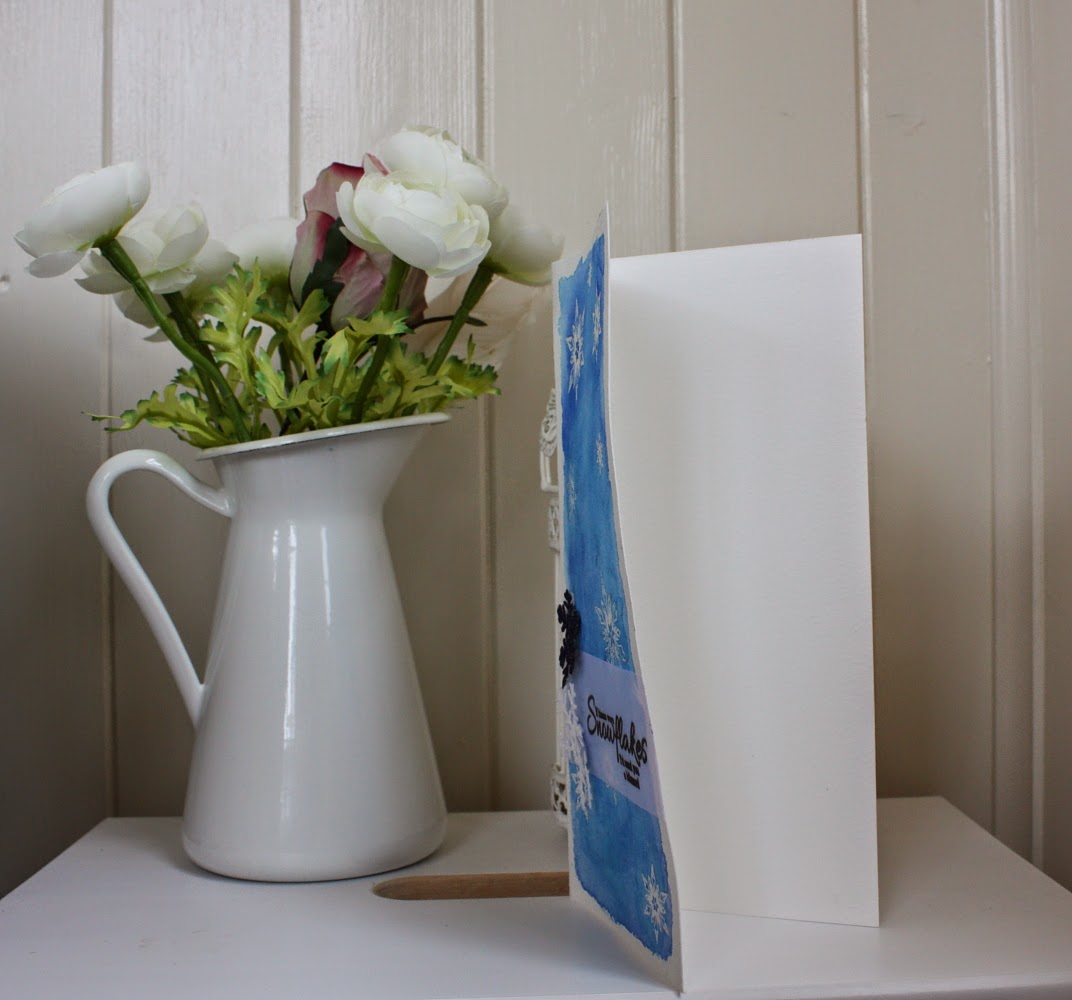
 - see?? Totally warped :-(

Any comments as always so very much appreciated.

I apologise for the very too the point post - got 101 things to do but was desperate to share my day's efforts with you all :-) xxx


Tuesday, 6 May 2014

Watercolour class day 1 projects

I can't actually believe that after just one day of the Watercolour class, I am already super inspired and have not one, but two cards to share! I have never taken an online class before but I am finding the format of it wonderful. We are shown videos of exactly how to create a card from start to finish, using a specific technique and then we are left to try the techniques for ourselves.

There were three techniques yesterday, but I only had the time to attempt two of them.

The first technique involved painting a pale colour wash on a piece of watercolour card and then applying a stencil until the paint was dry. Unfortunately I do not own any stencils yet (they are on my wish list), but I was determined not to let this deter me. I decided to try using an open embossing folder instead. I had no idea if this would actually work or not, but I was delighted to see that it had. I have to admit I was not overly excited by the result, but once I added a nice co-ordinating backing card, a satin ribbon, a tag, button and twine - oh and of course a bit of bling by way of a couple of co-ordinating sequins - I was actually over the moon with the end result. I would love to know what you think….


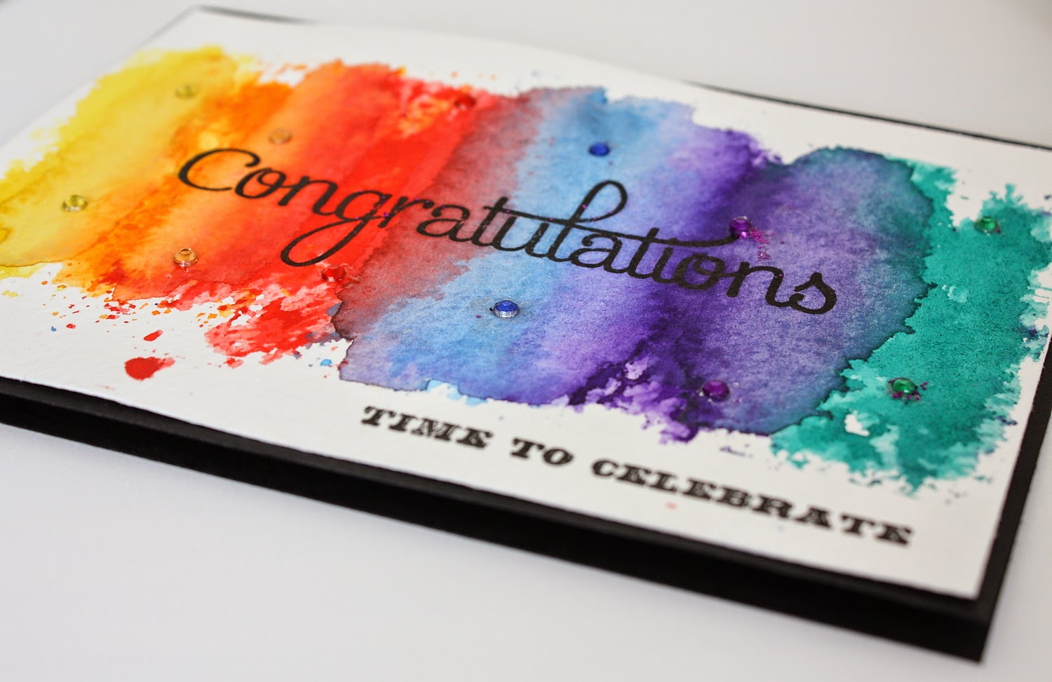
And now for the second technique - which again I didn't have the suggested resources for!! We were shown how to add some distress inks to an acrylic block, add some water and then stamp on to a piece of watercolour card. The process was repeated once the first layer had dried, first with the same colour and then working down the page, overlapping different colours. I decided to still try this technique, but since I didn't have distress inks, I just used watercolour paints.
Once the paint was completely dry, I added a black backing card, a couple of co-ordinating sentiments and of course-bling! I thought it would look great to add some crystals matching the colours of the watercolour paints. I am super happy with the end result!! I find the black backing card really brings out all the colours so much more. What do you think?


I can't wait for day two of the class being posted!! Any comments as always so very much appreciated xxx


Saturday, 3 May 2014

30th Anniversary card that fits perfectly for Less is More challenge and Muse!!

Afternoon all,

I am here with a card that I am SOOO happy with. I had the idea for this card buzzing around my head and began putting it together. I was thinking of making it as a wedding card for my friend, but then my husband remembered yesterday that it was the 30th Wedding Anniversary of one of our friend's and so he asked if I could make a card. This card was going to be perfect for this occasion and so I decided to use it for this new occasion instead. I had to make a few additions but that was easily done.

Here is the card….(apologies again for my photos….SO need to get back to using my usual set up with proper camera and better backing/lighting)


The card started first of all by laying strips of double sided sticky tape in row-right up against each other on a sheet of card. I then ran this through my Big Shot using the largest of the two Pure Floral Chrysanthemum dies by Uniko Studio. I then peeled the backing paper from the double sided tape and sprinkled the die cut with white glitter. I was really unsure if this would work, but I was delighted that it did!! I then die cut the smaller Chrysanthemum die by Uniko Studio and embossed the stamped image with gold EP, but I was not happy with it - the gold was too dark for the vision I had in my head. I tried it a second time with Enchanted gold EP and this worked perfectly!! I attached this die cut/embossed Chrysanthemum on to the glittered one.

I then hand cut a tag (yes, still to buy a tag die), and sprayed it with Gold Perfect pearls. This gave the tag a subtle glistening gold effect. Unfortunately this is not picked up in the pictures :-(

I die cut a butterfly from vellum using Uniko Studio's bright butterflies die. Earlier in the week I had made a card using a push pin and loved how it looked so I decided to do it again. This time however, I decided to cover the pin of it in some liquid pearls in bisque in order to make it a much paler shade. I pushed this throughout the butterfly and tag.

The sentiment is from a fabulous set by Waltzing Mouse called Big Day additions. I embossed this in the Enchanted gold EP. I then attached the sentiment using some foam pads the give a bit of height.

I had used a straight forward hole punch in order to make a hole in the top of the tag. I threaded some twine through this. The rage was then attached to a white backing card and a few matching sequins were added in the corner. Since this was to be for a significant wedding anniversary, I decided to use some pale pink pearls in order to create a number 30 free hand on the flower. I think this worked well.

My original idea of making a very 'white' based card came through inspiration from cruising on blog land. I have been particularly inspired of late by Gillian Ross from Made with Sparkle and also Debby Hughes from Lime Doodle. Gillian had created a new baby card that had lots of white space with just a hint of pink and Debby had created a white and gold card. These two cards were definitely my inspiration. I couldn't believe it when I then saw that Gillan's card is actually the Muse card at Muse Card Club. This means I absolutely have to enter this card in to this challenge. The Less is more challenge is to use three colours - which again I have done - white, gold and a touch of pale pink.

Here is the gorgeous card that Gillian created….isn't it just stunning.


Tomorrow's task for me is to get all my water paints organised and ready for starting the Watercolour for Cardmakers class on Monday. Am very excited!!

Many thanks for looking. Any comments as always so very much appreciated. xxx

Resources
Card - white from Papermill Direct. Vellum from Anita's
Stamps/Dies - Pure Floral: Chrysanthemum and  Bright Butterflies by Uniko Studio, Big Day Additions from Waltzing Mouse.
Inks - Papermania Enchanted Gold EP, Gold Perfect Pearls, Bisque Liquid Pearls
Embellishments - sequins from Hobbycraft, Pearls from Anita's, White glitter & Pushpin from stash. Twine from Papermania Capsule Collections.


Thursday, 1 May 2014

A quick birthday card

Hi all,

Yip, a busy week again will lots more running and little crafting time. I did however spend today sorting out my craft cupboard which had become an absolute mess and left me cursing when I couldn't find what I was looking for!! Usually my bone folder actually. I have now just to sort and iron a while bunch of ribbons my lovely Mum gave me and put them in to the jars I have been saving for keeping them in.

I did manage to squeeze in a really quick card today for a friend's birthday tomorrow (yes, cutting it a bit fine!!). She is a huge football fan, but unfortunately I am not and couldn't bring myself to make a 'football' card. Instead, I used the colours of the football team instead. Funnily enough, it is the same football team as the one inspiring the 65th birthday card for my other friend's dad.

There are a few 'firsts' that I tried out and loved! In general, I like the card but there is something missing/not quite right. I can't put my finger on it though and don't have the time to make any changes now!!!

Here it is,


Okay, so I started with a white base card and attached a layer of kraft card. I cut two tag shapes (no, I've still not got a tag die cutter yet - tut tut), one in a maroon DP and the other from kraft card. You can't see this from the photo (poor quality again, sorry), but the kraft tag was sprayed with Perfect Pearls in Gold which was a first for me…..Oooooh, it is gorgeous. The card has a lovely subtle glistening gold effect :-) I then wound some twine into a swirl and put this behind where the tags would go. I was hoping to join the two tags together with a mini clothes peg, but I don't have any left :-(, but I came up with a new idea…..a gold push pin!! Love it. I cut a butterfly from vellum and on the top half, traced the edge of it with liquid pearls in bisque….(think I like how this has worked). I then TRIED to run some glue along the bottom edges and sprinkled with white glitter. The effect I was hoping for has failed, BUT I think it makes a kind of rougher, grundgy, funky look as it is???? Hmm, maybe not!!

I then attached all of this on to the card. I then wrapped a candle in some other maroon DP (saw this done on a card via Pinterest and thought it looked cool!!) and attached to the front tag. I then stamped the sentiment and added a few sequins. I also added a pink crystal to the top of the push pin and a yellow one on the candle to make it look as though it's lit!! What do you think? Too much??

It's the from tag though, it's just not right. I think maybe the sentiment is too small or something????
Any ideas???

As always, any comments very much appreciated xxx

Resources used
Cards - White from Papermill Direct, Kraft card from Jellybean, DP from Papermania capsule collection, vellum by Anita
Stamps/dies - Bright Butterflies die by Uniko Studio, Sentiment from Clearly Besotted Tag Along.
Inks - Maroon by Hobbycraft, Perfect Pearls Gold
embellishments - crystals by Anita, Sequins from Hobbycraft, candle from my baking cupboard!!!, Twine by Papermania capsule collection.

Monday, 28 April 2014

Time Out Challenge 4

Evening all,

I hope you are all well. I am here with my latest card creation which is for the latest Time Out Challenge. I absolutely adored the inspiration given which is an amazing card by Virginia Lu as seen below….


How can you not be inspired by this amazing card? I really loved the layout of it and so I decided to replicate this in my version. I am really loving a black and white colour scheme with a flash of colour and so decided to go with that for this card. Here is my version…


I apologise that my photos are not so great lately. I am just busy with lots of things just now and so it has to be quick compact camera snapshots instead of my proper SLR photos!!!

For this card, I began with a white base card and layered it with black, then white again. I added a strip of black and white patterned paper - this in infact some gift wrap that I fell in love with!! I also added (and this was a first to try this) a strip of card with a strip of double sided tape added and sprinkled with white glitter. I am LOVING the result!! I die cut then stamped both sizes of Uniko Studio Pure Floral Chrysanthemums (yes, it's my favourite stamp). I embossed them with clear EP and then coloured both with spectrum noir markers in a bright fuchsia. I added these on to my pattern panel after adding some swirls of pink & white twine. I then stamped the Best Wishes sentiment by Waltzing Mouse on a rectangular piece of card and splashed it with some water-colour paint. I added some pearls to bring this panel alive a little. The card was finished off with some sequins as per Virginia's card.

I am actually really pleased with this card. It is quite different to what I would usually do, but I like it. I adore the layout and that is one I would most definitely use again.

Thank's for taking a look and any comments are always very much appreciated.

Laura xxx

Resources
Card - White & Black card stock from Paremill Direct. Gift wrap from Marks and Spencer.
Stamps - Pure Florals: Chrysanthemums by Uniko Studio, Sentiment by Waltzing Mouse - Big Day additions set.
Embellishments - twine by papermania capsule collection. Pearls by Anitas, Sequins by Hobbycraft.
Ink - fuchsia by Hobbycraft, EP by papermania, Spectrum noir markers, glitter from stash.


Saturday, 26 April 2014

Marie Curie Cancer Donation

Helllo hello,

I am here to report some very exciting news with regards to the card I created for my Guest Design spot  at Uniko Studio.


Since this was created during Cancer awareness month, I decided to auction the card via Facebook in order to raise funds for Marie Curie Cancer care. I was absolutely amazed with the generosity of people and the card in fact raised a staggering £75!!!!! 

Thank you to all those who got involved.

Laura xx

Watercolour online class

Hello all,

I am so sorry I have been MIA…..I ave been mega busy doing my friend's wedding invitations. Photos will hopefully follow tomorrow!!

I am so excited to tell you all that I have signed up to undertake a online class called 'Watercolour for Card Makers.' As some of you know, my grandad passed away a few weeks ago. He was an avid watercolorist and I am honoured to inherit his art supplies. I have no clue whatsoever about water colouring and so when I saw this class come up - it was almost light a sign from above!! I just knew I had to sign up for it.

Pre class, we have had some videos to watch and some homework tasks. This has been so helpful already in helping me to make sense of the resources I am now the proud owner of. I have a few photos to show you what I discovered….


I adored this set of paints by Reeves


I was delighted to find some of the make of paints as shown in our pre class videos. These were in fact the only set that had been opened for use, so my Grandad clearly liked them too!!!


This fabulous little book shows you how to achieve different colours by telling you the colours to mix together.


I found this too, which I can only assume is also for helping you mix colours. I've not quite worked out how to use it yet though!!


There were a set of paints that I think are genuinely from Singapore - my Grandad was a great traveller and so he probably picked them up whilst on holiday there. They haven't been used….yet!!


There were also two types of watercolour papers


Now, on to the homework tasks.

I cut strips of watercolour paper and painted a square of each of the colours using the different paints.


The bottom strip was done using the Chiltern Wove paper which I found very thin and rough, whereas the Rockingford paper was much thicker and had a nicer texture.

I have taken a close up picture in order to show the textures of the two papers in detail….

 This is the Chilten Wove (Looks like waffle)

 This is the Rockingford (more of a hammered texture)


The second task was to try mixing up some colours to see the resulting colour. I found this really very interesting. I found that I was particularly drawn to mixing blue and green shades together. I think because this is my favourite shades of colours just now for card making!


Finally, I made the lattice as we were recommended to do.


My lines are a little wonky, but I think that is okay!!

I have made a few cards in the past month that make use of watercolours, but it has simple been a plain coloured panel, straight from a paint tube with no mixing etc. I am so very much looking forward to finding out how to use watercolours in lots of different ways in my card making.

Here are my previous examples ….

The turquoise panel…

 The back tag.

Roll on 5th May, when class starts!!

Laura xxx